What is this App about?
This app provides a solution to a widespread problem found with most comparative return charts and numbers on the web. The non-inclusion of income events such as dividends, coupon interest and distributions make the return charts of little use to long-term investors, additionally they can 'optically bias' them against lower volatility income type assets. The implication of this anomaly extends to sub-optimal allocation of capital, where funds can get invested into lower returning higher risk assets, when a more stable and consistent option is available but overlooked – due to the potentially misleading impact of ‘price only’ charts (see App Gallery for illustration). If the interest on a mortgage loan would be 0%, the installments would drastically decline, think of those installments as your income on capital invested - you would not choose such investments. Unfortunately, those very investments are generating a steady income but not getting reflected on 'price only' charts, thus portraying an incomplete and incorrect picture of what would otherwise be a good investment. For whatever reason, despite user demand (see the Research tab) most of the websites do not produce Total Return (TR) charts. That's where this App comes in. We have condensed the whole process to a few taps on two screens.
- This App allows the user to plot Total return charts that include both dividends and coupon interest
- Most business and finance websites / Apps provide Price return charts only, thus ignoring the income variable in the total return equation. This is not a 'third decimal' type error, it is a major omission - see screenshots and the discussion section below.
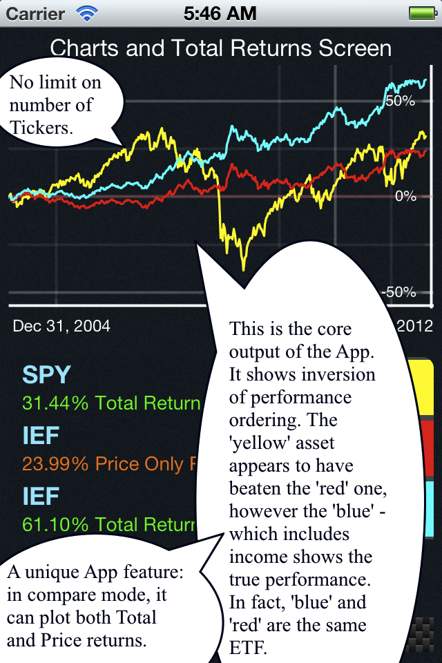
- This can lead to inversion of performance ordering, where a bad asset actually appears to be outperforming the good and often lower volatility asset.
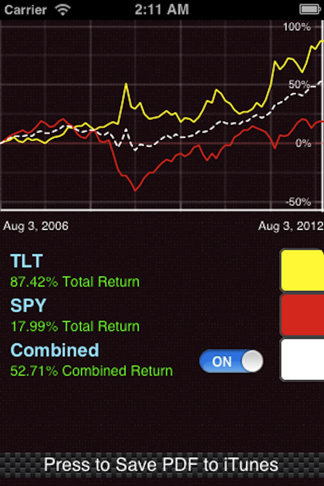
- A new feature allows tickers to be combined into a trackable portfolio thus enabling stress-testing on back-dates. This is a very powerful (cool) feature.
- In the end it is the investor who loses due to the 'optical bias' created by incomplete charts. Look closer.
Comparison Options
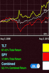
One of the unique features of the App is that it can simultaneously plot the Total returns as well as the Price returns on the same ticker along with other tickers in the compare mode. This instantly gives the return delta (difference) accruing from dividends and coupon interest, thus enabling the user to evaluate the cumulative returns arising out of the seemingly small stream of dividends and interest (see Technical tab for more information). Often this difference can run into 3-digit percentage numbers (click on the App Gallery and then click on the screenshots). In single security mode the App returns cumulative return percentages on the Y-axis (not prices). A *new feature* combines the tickers into a single portfolio so that you can back-test its performance over any time interval (also called stress-testing).
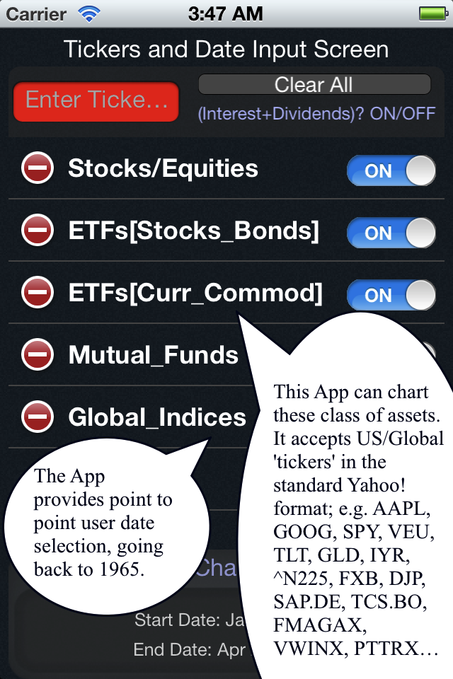
US/Global assets and other features
The App covers both US and Global stock markets and has history going back to 2000. To the best of our research, no other App or website offers the combination of features that are included in ReturnFinder. The problem being rectified by the App has been written up in the WSJ (Jul 2011, Dec 2011) and other professional journals. The App covers not only ETFs (for bonds, currency, commodities, equities) but Mutual Funds and Stocks as well – besides it gives the user full control over start and end dates, instead of pre-determined time frames. It even auto-determines the earliest trade date for a ticker. This dual mode plotting feature can be useful to study short-selling income leaks during the establishment of long-short pair trades. See the 'Technical' tab for more uses.
-
OS Support iPhone iOS 10.0, iPad 10.0 or greater Version 1.1 iTune Release Aug 07, 2012; June 2015, Nov 2018 Twitter/Facebook @Cloud_Epsilon // Find us on Facebook App Production US-Canadian-German

Research Publications and the ReturnFinder App
![]() Research indicates that over 40 million investors look at finance websites monthly. This site seeks to provide important quant metrics typically not available to retail investors. Information often leads to action, in this case allocation of scarce capital. With incomplete information, the investor misses out in the end, sometimes they are not even aware of the inaccuracies or the deficiencies. The ReturnFinder App provides a solution to one such problem.
Research indicates that over 40 million investors look at finance websites monthly. This site seeks to provide important quant metrics typically not available to retail investors. Information often leads to action, in this case allocation of scarce capital. With incomplete information, the investor misses out in the end, sometimes they are not even aware of the inaccuracies or the deficiencies. The ReturnFinder App provides a solution to one such problem.
Research Note on the ETF Variance-Covariance matrix
The ETF correlation matrix gives us the ability to understand the cross-correlations on various markets, sectors and asset classes. It is a 200 element matrix that utilizes a five year weekly return series and is thus based off 1 million plus unique data points. A high pairwise correlation is a high Sharpe ratio proposition, while a low pairwise correlation scenario is a high Alpha potential. The availability of large-scale computing power and the web as the new platform for information dissemination enables us to put this on the web, something that until recently was the preserve of specialized providers. Also available is the ETF Variance-Covariance matrix, based on weekly returns. We think that a longer interval period (such as monthly) results in information loss, especially in todays fast paced trading environment. Legacy issues probably constrain the generation of high frequency Var-Cov matrices, we hope to provide unique value added by operating outside such parameters. These correlations can be utilized to structure an optimal asset allocation framework, prevent redundant diversification, structure market-neutral spread trades, and control risk in a portfolio. (* Correlations are subject to the well-known phenomenon of inter-temporal non- stationarity and sign inversion. As such they are best utilized as an indicative and explanatory factor, rather than a predictive factor.) Other research on a sample of advanced finance and mathematical topics is also presented here, for the interested viewer. The Bootstrapping routine allows for repeated sampling to estimate a normal distribution from a non- parametric or small-size sample - a fully functional downloadable file written in Excel VBA is attached. Such methodologies are utilized in our work to generate distributions for ETF's that have short trading histories. This is essential for fast paced hedge funds and traders who cannot afford to exclude an asset just because it is a new issue. This work is purely for the purposes of research and understanding financial market dynamics.
Publications for Download/Review, mostly by Pankaj Pank Agrrawal, PhD
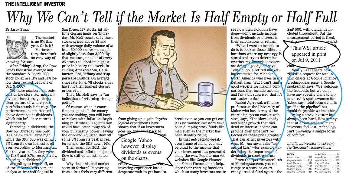
Wall Street Journal - Price Charts Can Mislead, Dec 2011
The Problem with Many Performance Charts, Advisor Perspectives, Nov 2011
Wall Street Journal - Why We Can't Tell if the Market is Half Empty or..., Jul 2011
Journal of Investing paper on the problem of Dispersion of Betas on finance websites.
Financial Analysts Journal: Dilutive effect of Options on EPS.
Journal of Investing: Hidden Risk in Value Line's Rankings.
JREPM: Stock-REIT Optimal Allocations.
CQA Talk: Blending Quantitative and Fundamental Investing.
Managerial Finance: An Automation Algorithm for Web Harvesting.
Paper 2015 Impact of investor sentiment on short term returns.
Paper 2014 Factors determining ETF Liquidity and Transition.
Paper 2010 How to average PE ratios - Harmonic mean vs Airithmetic vs Geometric mean.
CQA Agrrawal quant fundamental blending glass box Northfield 2001 2002 Conference Presentation.
*Listed below are links to social sites that discuss the charting problem*
Discussion of Total return charts on LinkedIn - May 2008
Discussion of the issue on EarlyRetirement.org
Discussion of Total return charts on the Morningstar finance portal
Discussion on Bogleheads - a finance BB inspired by Vanguard founder John Bogle
Additional discussion of Total return charts on Bogleheads
Looking for Total return charts
A request from Canada - Feb 2012
Sigma1 Posting on Flaws in Stock and ETF Charts - May 2012
SeekingAlpha article: Historical Charts are Misleading - October 2012
Version History
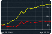
App Showcase 1.2 April 23 2012
Quisque eleifend, arcu a dictum varius, risus neque venenatis arcu, a semper massa mi eget ipsum. Proin sed odio et ante adipiscing lobortis. Lorem ipsum dolor sit amet, consectetuer adipiscing elit.
- New Quisque eleifend, arcu a dictum varius. Mauris placerat eleifend leo.
- New Risus neque venenatis arcu
- Fixed A semper massa mi eget ipsum quisque eleifend, arcu a dictum varius.
- Fixed Proin sed odio et ante adipiscing consectetuer adipiscing
- Fixed Lobortis lorem ipsum dolor sit amet
App Showcase 1.1.1 October 13th 2011
Arcu a dictum varius, risus neque venenatis arcu, a semper massa mi eget ipsum. Proin sed odio et ante adipiscing lobortis.
- New Quisque eleifend, arcu a dictum varius
- Fixed A semper massa mi eget ipsum risus neque venenatis arcu
- Fixed Proin sed odio et ante adipiscing
- Fixed Lobortis lorem ipsum dolor sit amet
- Misc Lobortis lorem ipsum dolor sit amet a semper massa mi eget ipsum
App Showcase 1.1 June 24th 2010
Neque venenatis arcu, a semper massa mi eget ipsum. Proin sed odio et ante adipiscing lobortis. Lorem ipsum dolor sit amet, consectetuer adipiscing elit.
- New Risus neque venenatis arcu
- New Quisque eleifend, arcu a dictum varius
- Fixed A semper massa mi eget ipsum risus neque venenatis arcu
- Fixed Proin sed odio et ante adipiscing
FAQ
![]() Some frequent queries we get:
Some frequent queries we get:
![]()
![]()
- Is this App a trading device?
- Far from it. This is an analysis tool, not a stock selection tool, not a recommendation service nor a trading device - it just processes vast amounts of information that already resides in the public domain and makes it readily available to the user, saving them tedious calculations on the spreadsheet. Please note that there are many other metrics to consider before making an informed decision on the suitability of an investment, this App only provides relative return charts and cumulative total performance numbers, it is not designed to be a one-stop heuristic, method, mechanism or a solution.
- Why an App and not a website?
- Conventional wisdom would dictate that, just as the conventional charts are 'price only' - it would have been simpler to put this on a web-interface, but the desktop has become mobile and we wanted to have a greater outreach. We want to provide the missing part in some very critical information, to a group that has obviously demonstrated that it embraces technologies faster. We are doing the calculations and presenting it in a format that is visually interesting, we want you to think about how an investment fits into your risk-return framework and reflect on it even when you are not at your desk, why not? Tim Cook, CEO of Apple said this about the growth of mobile computing (April, 2012), "through the last quarter, I should say, which is just 2 years after we shipped the initial iPad, we’ve sold 67 million. And to put that in some context, it took us 24 years to sell that many Macs and 5 years for that many iPods and over 3 years for that many iPhones." Eric Jackson, PhD (Columbia) of Forbes says this, "Mobile companies born since 2010 have a very different view of the world. These companies – and Instagram is the most topical example at the moment – view the mobile smartphone as the primary (and oftentimes exclusive) platform for their application. They don’t even think of launching via a web site."
- What was the App coded in? There must be a lot of wheels and gears grinding in the background.
- Frankly, this became a bigger undertaking than we thought it would be. This is the product of about five years of research and many months of design, development and testing in both the US and Germany. The shell is written in Objective-C (the language for Steve Job's NeXT and often used for most MAC software). Cocoa Touch is Apple's UI framework to develop software for their devices. JSON (JavaScript Object Notation) and Core Plot libraries are invoked as well. Research was conducted with VBA macros and packages such as Mathematica (Wolfram), GRETL and PAST.
- Why is there a charge for the ReturnFinder App? How is the Free version different?
- Google this: "typical app development cost" - $12,000 to $150,000 - just the amount of electricity that went into keeping the Macs up, not to mention the Big Macs that went into this, runs up the bill! If you miss out a 2.99% yielding asset due to an incorrect interpretation of its performance - on a $10,000 investment that would be $299 foregone per year. Not including the research, just the App design, development and testing has run into hundreds of people hours. We think that a serious user that values their investments will think of this productivity app as a minuscule but wise investment, at least worth a mac! Some Pro trade stations through which you can have this information charge upwards of $1,500/month.
*FREE vs FULL Version: While all functionality is retained in the 'Free/Lite' version, the CorrectCharts Lite version has a limitation of 8 cycles of use per day, max of two tickers and a max time interval of 9 months (access it at CorrectCharts.com). In the ReturnFinder version there are no cycles or interval limitations (earliest data date is 2000) and 8 tickers can be inputted, also a combined portfolio can be charted. The CorrectCharts Lite version is geared towards students and those wishing to first learn about the App. We want you to enjoy the Lite usage and hope that you will upgrade to the Return Finder or CorrectCharts Pro and support the ongoing development of the Apps. FYI, the CorrectCharts Pro version accepts unlimited tickers and has data from 1987, it however has no 'combined' portfolio option and is priced slightly higher. All three are released by Cloud Epsilon LLC.
- Do 'Price only' charts bias investors against bonds and dividend paying stocks?
- After all, why do people look at comparative charts in the first place? To gauge relative performance, which eventually feeds into their decision process. So if a bond investment appears flat after a decade and a half, when in fact it generated over 200% (means value has tripled), we have a situation (see App Gallery #3). The problem is when a investor does not see that performance manifest on a chart and thus opts for the more volatile option that at least seems to go somewhere (App Gallery #2). Then a visual matter becomes real because a potentially good investment is not even considered (see SHY in dual mode, On and OFF, 5 years). Bonds have been delivering performance since 2000, but a short term trading mentality and an insistence on capital gains could well have kept some investors from benefitting from these lower volatility income-generating assets. Einstein reportedly said, “The most powerful force in the universe is compound interest.” But if there is no intermittent income, there is no compounding! Even in the single security mode our App returns % cumulative return only, because that is what the holder gets at the end of the holding period. However, bonds are risky too, when interest rates rise rapidly bond portfolios often see erosion of value due to the so called 'price risk' - there is 'no free lunch'...who said that? Diversification and moderation is often the key, but sometimes hard to accomplish. The Research tab has journal articles on this topic.
- What's in the icon and name ReturnFinder? Is the technology portable?
- The icon has the Bull and the $ sign, referring to generating returns in the Stock market by paying attention to income generating assets. To the best of our information, we have not seen elsewhere the combination of features that this App offers. Our technology is portable, however, the domain is not for sale.
Get In Touch!
You can get in touch with us @ ReturnFinder via the contact form provided below. Whether you have a question on your mind, an idea, or want to provide us with some feedback, just fill out the form and our team will be glad to help you out.
Technical
![]() A few usage type queries:
A few usage type queries:
![]()
- How do I get started? (for the *Free* version)
- Tickers are the only item you type in the App - they are in standard US format and can be looked up on the web (such as Yahoo! Finance) by entering partial company/issuer names. For the Free version:
I. Take two tickers IEF, BND and enter them in the ‘Red’ ticker-entry box (use a space or a comma between the tickers) and swipe left –that’s it!
*In the full version, you could add SPY with 4 years and see performance-inversion with BND in the OFF position. Thus BND appears to be an inferior investment compared to SPY, when in fact it scores better on both the risk and return dimensions (Sharpe ratio).
II. You will see a chart with two lines and a table below with ‘total returns’ for the default one-year period.
III. Now tap the ‘Date Picker’ panel on the main screen to select a 18 month timeframe (Free version limit), remember to hit the ‘save begin date’ button and tap ‘Done’ – this step increases the default 12 months to 18 months.
IV. Now, swipe back and hit OFF for the BND ticker, then swipe left.
V. This will give you a flatter BND line due to the exclusion of interest income (not good). This is how most websites plot the charts, making comparison charts virtually meaningless, since significant dividend or interest income is not even included in the calculations or the graphing. - How do I get started? (for the $Full$ version)
- Tickers are the only item you type in the App - they are in standard US format and can be looked up on the web (such as Yahoo! Finance) by entering partial company/issuer names. After you have a couple of tickers in mind, say SPY and IEF enter them in the 'Red' ticker-entry box (use a space or a comma between the tickers) and swipe left - that's it! You will see a chart with two lines and a table below with total returns for the default 1 year period. This particular case is for the US Stock market versus US Treasury Bonds. Now you can make it interesting: swipe back, enter SPY, IEF again, tap the 'Date Picker' and select a 5 year window (remember to hit the 'save begin date' button) and tap 'Done' - now you see two lines with a wider dispersion. But wait, I entered 4 tickers? OK, swipe back and turn OFF a pair of SPY and IEF, then swipe left. Now you see 4 lines, the spread between each line is the 'invisible' income portion of total return. Notice the large difference in the associated table for IEF. Also notice how IEF has been a slow and steady return generator, with almost half of its returns coming from coupon interest. Financial assets such as bonds, convertibles and high dividend stocks, ETFs and mutual funds appear visually unattractive on websites that provide price only return charts. The 'optical bias' can lead to actual wealth loss, if a potential investor forgoes such investment opportunities in favor of typically higher volatility assets.
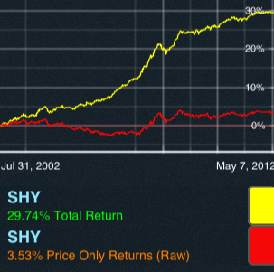
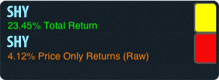
>> Try SHY, SHY with a 10 year date interval, and turn OFF the button for the second SHY, notice the 25%+ difference? It is the same short duration US Treasury bond ETF that with almost no volatility has produced a 25% return (and state tax shielded, since it is a US Treasury bond vehicle). BTW, use 'clear all' to clear all tickers from the previous run. Note: The idea is that you try these four examples out yourselves, the small images serve only as a reference to compare your output.
>> Try VFINX, VFINX with start date 1987, and turn OFF the button for the second VFINX (Vanguard SP500 Index fund) - of the 700% return on the SP500 since 1987, over 350% comes from dividends - many people say index investing is 'boring' - yes the way it looks on 'price return' only charts. Ignoring 350% on a $100,000 investment is like leaving $350,000 on the table. Note: No accompanying image.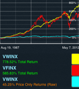
>> Try VWINX, VFINX with start date 1987, notice the about 200% difference? This is also an example of how balanced income funds can add steady value over time, the Vanguard VWINX fund has an asset allocation of about 65% US Bonds and 35% Equity. Notice the lower volatility of the 'yellow' line, that is the income fund and the difference is not minuscule. If you add VWINX one more time and turn dividends OFF, the third flat 'blue' line will make for a very uninteresting low volatility investment. But that is not the case. This App changes that.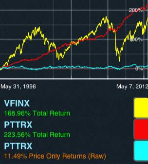
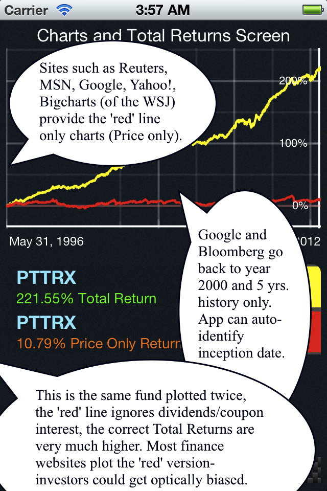
>> Try VFINX, PTTRX, PTTRX with start date 1987, and turn OFF the button for the second PTTRX, notice the huge 200%+ difference!? This is also an illustration of how bond funds can add steady value over time. The flat ‘blue’ line and the nice ‘red’ line are the SAME asset (in this case PIMCO’s Total Return fund), would you invest in the ‘blue’ asset if that and the 'yellow' lines are all you saw after 16 years? But that is what is seen on most sites that have ‘price only’ returns, naturally it disinterests most investors (seeing a mere 11% vs the invisible actual 223%). Note: the graph date auto-defaults to 1996, since that is the earliest history on PTTRX. - ***A list of tickers I could plug in to start exploring?
- Sure, enter SPY, VEU, IEF (US market vs all International markets vs medium term US T-Bonds), or XLV twice in both ON and OFF mode - all these for 5 years - you will see the income differential. Now change the date ranges, remember to hit the 'set begin set end date' buttons in the date picker. The UI should be intuitive. You could also instantly find out which of Europe, Emerging or the US markets paid the highest dividends, say in the last 12 months, enter EZU EZU EEM EEM SPY SPY and alternately switch the ON/OFF button, do it for 1 year, the pair that has the highest difference is the one you are looking for - such an experiment could take quite some time on a spreadsheet. Also look at the App Gallery - it has a few illustrative examples that bring out a point or two. BTW, you can enter multiple tickers in the App 'ticker box' - use a space or a comma as a delimiter. Tickers are in standard US format and can be looked up on the web (such as Yahoo! Finance) by entering partial company/issuer names.
- ***How do I determine the earliest start date for a ticker?
- That is easy, the App automatically determines the earliest trade date if the user start date precedes the actual first trading date of the ticker in question. To simplify, say you are not sure of Microsoft's (MSFT) first trade date, just pick 1950 as the 'start date' and the App will display the week of March 13, 1986 as the inception date. Also, if two assets are entered the graphing date defaults to the most recent date, so if MSFT and GE were entered with 1960 as a start date, the graph would start in 1986. Check out IBM, GE with 1950 as the start date!
- What does the ON/OFF button do?
- The ReturnFinder has two sets of ON/OFF switches. The first set to toggle the dividends and the second one to turn the 'combined' portfolio line On/Off on the second screen.
- The Dividend ON/OFF switch enables the user to see what a chart would look like if no dividends or interest were included in the calculation of Total return. The ON state is the default state and includes all income streams. Sometimes charts do not include dividends or the impact of splits or reverse splits in the price history and yet a chart gets plotted, leading viewers to either think that there has been a severe price action or they end up questioning the graph. So we created the OFF button where the returns are purely raw and include neither income nor corporate events. For companies with no splits the OFF button provides a 'price only' return that can be compared with itself by having a second ticker in the ON position, which would give Total returns. Try SHY, SHY in ON and OFF position for 1 year or 5 years. Also try C, C in ON and OFF position, you will see the impact of a 1 for 10 reverse split in 2011. Note: if the security has undergone a stock split then the OFF position return has no relevant information and cannot be directly compared with the same security return in the ON position.
- Sometimes the App takes a few minutes to run? Memory usage?
- The App could take a few seconds if you have a long interval period coupled with a large number of tickers, the problem would be compounded if the connection is slow. This is not the same as retrieving a current quote from the internet, for 5 tickers and 5 years we are looking at live downloading and subsequent on-the-fly processing of about 6300 pieces of data. No data is saved in temporary files/cache as the variety of combinations for each ticker is almost infinite. For each cycle/run, the date for each ticker is downloaded and processed separately and thereafter released after visualizing it, keeping the memory footprint of the application at a minimal.
- Disclaimer: All tickers used on this site/App are for purely illustrative purposes and should not be construed as investment advice of any type, ReturnFinder has no association of any kind with the issuing companies, please see the full disclaimer on the sidebar of this site.
Audience
![]()
- Who could use this App?
- We definitely have two groups in mind: the younger generation of potential investors who are comfortable questioning the status quo and the serious long-term investor for whom the markets are not a mere trading platform. The App helps you focus on the real picture - which is about Total Returns - the nuts and bolts are taken care of within the App.
- Anyone who is an investor or is considering mid to long term investing: they will want to see what the total return on an asset has been between any two points in time in order to assess its income potential. This App gives you that number.
- Anyone who has looked at a stock chart on the web or plans to do so, especially in the compare mode, because they are actually looking for relative performance - which must include income based return too. Many assets have income yields over ten times the capital gains yield - that cannot be ignored. This App includes those items.
- Anyone who wants to estimate Stock/ETF/Mutual Fund total returns and estimate its return breakdown into price and dividend (or coupon income) returns.
- Anyone wanting to analyze potential short-selling income leaks during the establishment of long-short pair trades.
- Anyone who has a vague idea that bond mutual funds/ETFs are a good source of steady income but are not sure how to calculate it and compare it with equity assets.
- Anyone who is a true long-term investor and wants to see how income funds have been silent money-making machines over 5+ year horizons.
- *Anyone who is fed up with meaningless comparative return plots ('price only' returns) typically seen on the web that can create so much confusion in the minds of the early as well as the seasoned investor.
- Do I have to be pro or a Quant jock or a trading type, or a Guru to use this App?
- Great question! Neither, none. Eben nicht! We've simplified all of this to two screens on your iPhone and just a few taps. That is why we decided to App this idea, so that each and every potential investor could see the true returns and focus on how a chosen asset fits their portfolio, instead of making it an exercise in number-crunching. What is being delivered by most sites on the web has literally brain-washed one if not two generations of investors, who literally think of dividend and income payouts as chump-change (maybe because they are reported as pennies on the dollar) and bond investments as 'boring' - thus foregoing steady income assets in favor of volatile price-only assets. See for yourself - just look at some of the screen shots on this site and punch in the tickers.
- Disclaimer: This is an analysis tool, not a stock selection tool, not a recommendation service nor a trading device - it just processes vast amounts of information that already resides in the public domain and makes it readily available to the user, saving you tedious calculations on the spreadsheet. Please note that there are many other metrics to consider before making an informed decision on the suitability of an investment, this App only provides relative return charts and cumulative total performance numbers, it is not designed to be a one-stop heuristic, method, mechanism or a solution. Please see the full disclaimer on the sidebar of this site.